
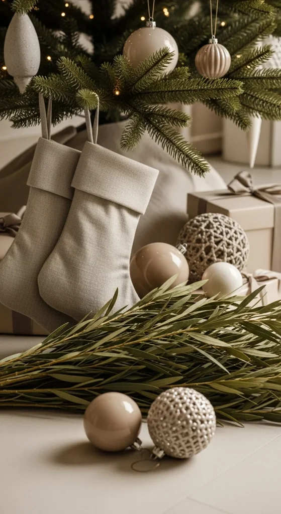
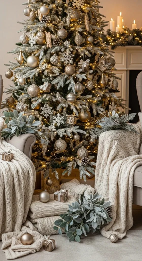
Neutral holiday palettes create a calm, soft, and peaceful atmosphere. They bring a soothing charm into your home without loud colors, making each room feel cozy and balanced. Soft beige, warm taupe, muted gold, gentle whites, and stone tones all work well together. These ideas help you decorate in a simple, stylish way that fits a quiet holiday mood. Each palette includes easy styling suggestions, simple swaps, and practical décor examples that work for any home size.
1. Cream & Warm White Glow
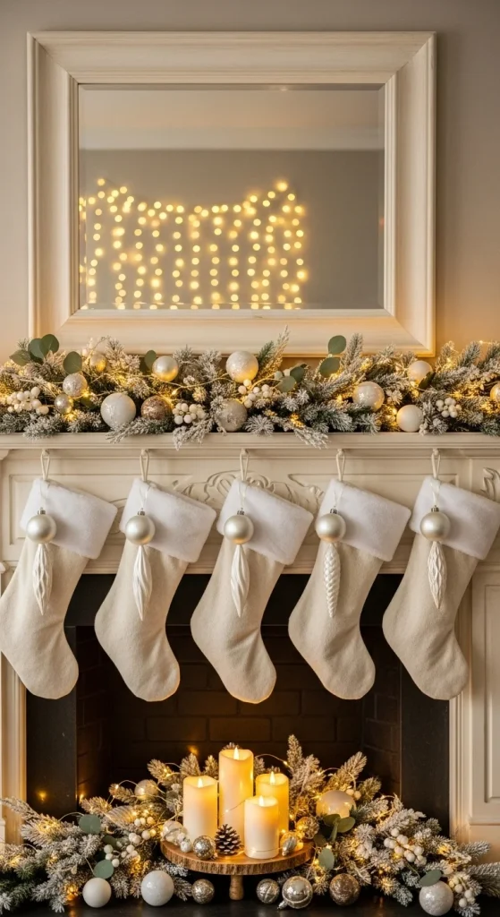
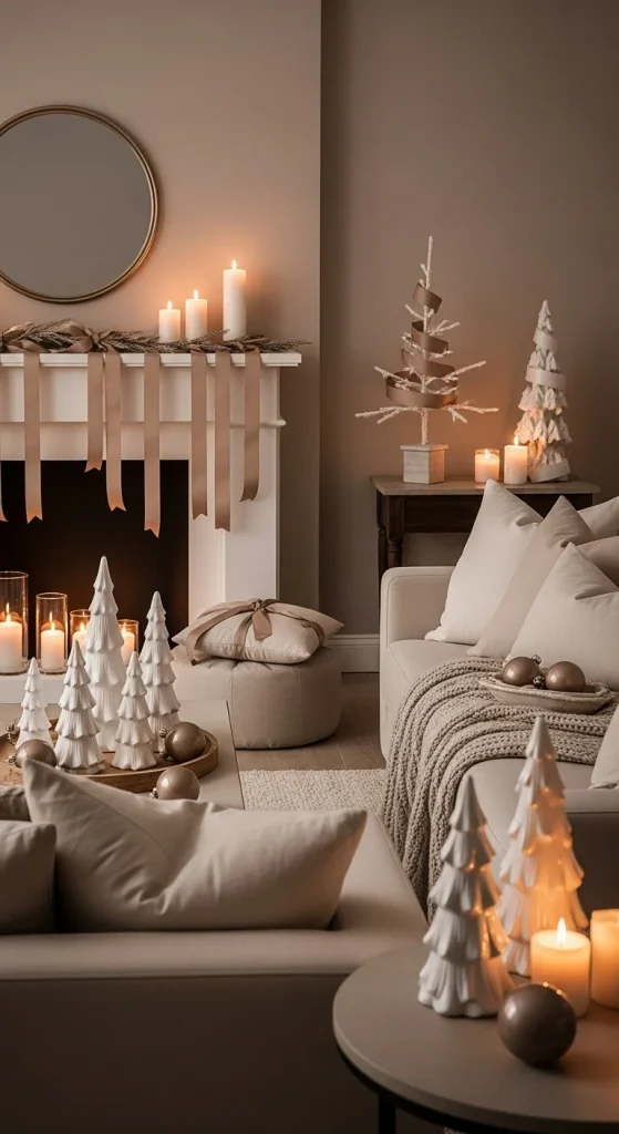
A cream and warm-white palette creates a gentle holiday look that feels calm. Keep the base simple by using white stockings, cream candles, and light ceramic décor pieces. Add warm string lights for a soft glow. For texture, include a chunky knit throw or boucle pillow. You can make your own cream ornaments by painting old baubles with matte off-white acrylic paint. Cluster a few candles together on a tray instead of spreading them across the room. Add a basket with folded white blankets to bring in soft layers. If you want depth, mix matte and glossy whites. This palette works very well with natural wood furniture because the tones match easily. Use dried branches or small pine stems to keep the look grounded. The goal is to create a calm holiday corner that feels soft without relying on color.
2. Beige & Soft Gold Accents
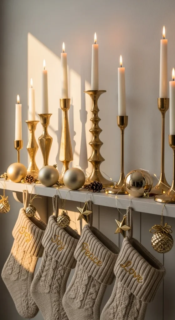
Beige with soft gold creates a quiet luxury effect. Use simple beige textiles as your foundation—think throw blankets, pillows, or a neutral tree skirt. Add soft gold touches sparingly to keep the palette balanced. Gold candle holders, small gold ornament clusters, or a gold tray add a warm glow without taking over the room. This palette works well if you prefer a subtle shimmer. You can spray-paint old décor pieces using satin-gold paint to keep the look affordable. Keep your gold pieces small and grouped together—this prevents the metallic accents from feeling heavy. Pair beige with natural materials like woven baskets or wood bowls to keep the palette warm. Use warm-white lights instead of bright ones for a softer look. This palette is great for living rooms and entryways because it blends well with everyday décor.
3. Taupe & Stone Neutrals

Taupe is perfect for creating a calm holiday palette. Mix different taupe tones with stone-colored accents to add depth. Start with taupe stockings, stone ornaments, or taupe-wrapped gifts. Add taper candles in gray-brown shades to build warmth. For DIY décor, wrap empty boxes in kraft paper and tie them with taupe ribbon. Use textured fabrics like wool, waffle knit, or ribbed cotton to keep the palette interesting. Taupe works beautifully with wood furniture, so add wooden beads, a rustic tray, or a wooden nativity set if you want natural elements. This palette feels grounded and works well in homes that already have neutral walls. Keep lights subtle; warm fairy lights fit perfectly here. Combine matte stone pieces with glossy taupe ornaments for small contrasts.
4. Ivory & Natural Wood Tones
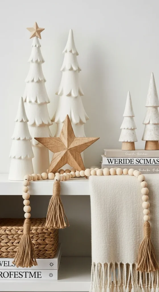
Ivory paired with natural wood creates a warm, soft holiday palette. Use ivory accents as your base—ivory pillows, ornaments, or a tree skirt. Add wood through bead garlands, wooden trees, or woven baskets. This palette works especially well if you enjoy rustic or Scandinavian styling. DIY wooden ornaments are simple: buy plain wood slices and tie twine loops on top. Keep décor minimal and highlight the textures rather than filling every area. If your tree has natural wood ornaments, balance them with ivory baubles to maintain softness. Add a wool rug or knitted blanket for cozy layers. Use warm lighting instead of bright white—it pairs better with wood tones.
5. Sand & Caramel Holiday Tones
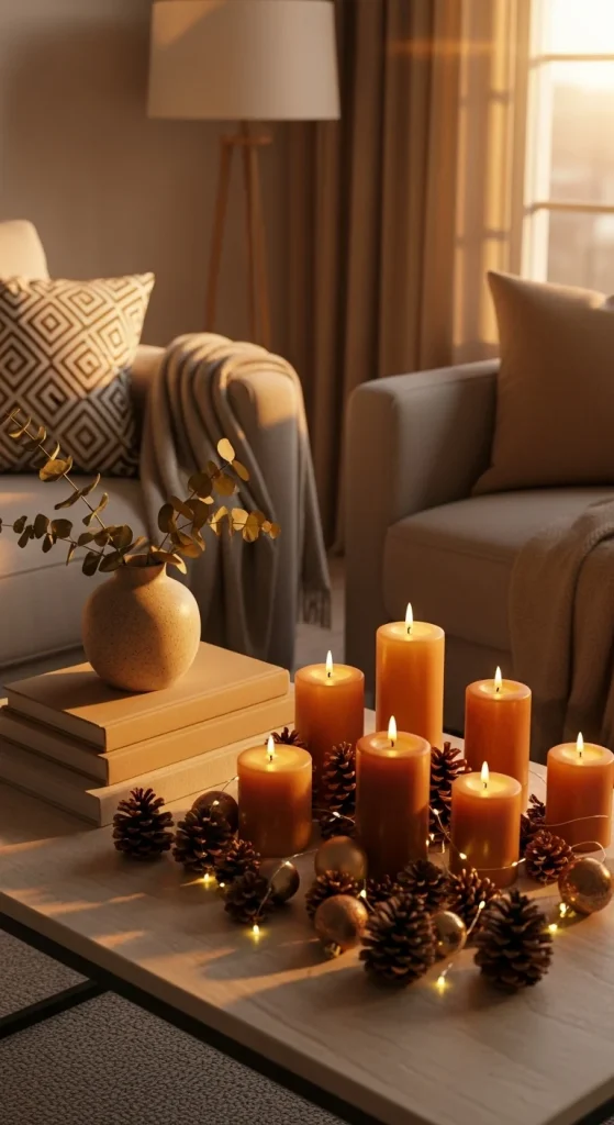
Sand and caramel tones are perfect if you want a warm, grounded holiday palette. Start with sand-colored pillows, blankets, or table runners. Add caramel touches through candles, ribbons, or wrapped gifts. Caramel works well in small accents because of its richness. You can reuse old candles by painting the glass holders in caramel paint. Add wood bowls or amber glass pieces for extra warmth. If you want greenery, choose dried stems instead of bright ones. Keep décor layered but simple to avoid making the palette heavy. Sand and caramel pair well with cream or soft white, so use those as balancing tones. Group a few caramel items together to avoid spreading the color too thin.
6. Linen & Warm Gray Palette
Linen and warm gray create a modern, calm holiday feel. Use linen-colored pillows, stockings, or tree skirts as your base. Add warm-gray ornaments or tapered candles to bring depth. This palette works well in minimalist homes because it keeps everything soft without adding brightness. You can paint old ornaments using warm-gray craft paint for a budget-friendly touch. Mix matte and satin textures to keep the palette interesting. Add a linen table runner or neutral wreath to tie the theme together. Keep the décor grouped—too many scattered items make the palette feel busy. Warm-gray works well with greenery, especially eucalyptus or olive stems. Use soft warm lighting to keep the palette cozy.
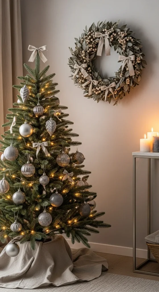
7. Pearl White & Silver-Neutral Mix
Pearl white mixed with soft silver creates a bright neutral holiday palette without going overboard. Use pearl-white ornaments, frosted branches, or white ribbon as your foundation. Add soft silver sparingly—small bells, thin ribbons, or silver candle holders. Avoid shiny chrome pieces; choose matte or satin silver for a calm effect. You can spray-paint branches using light silver paint for an easy DIY project. Add faux snow or flocked décor if you want a wintery texture. Keep the look soft by mixing pearl ornaments with frosted ones. Pearl white pairs well with greenery, so add eucalyptus for a cool-toned balance. Use warm lights to soften the palette.
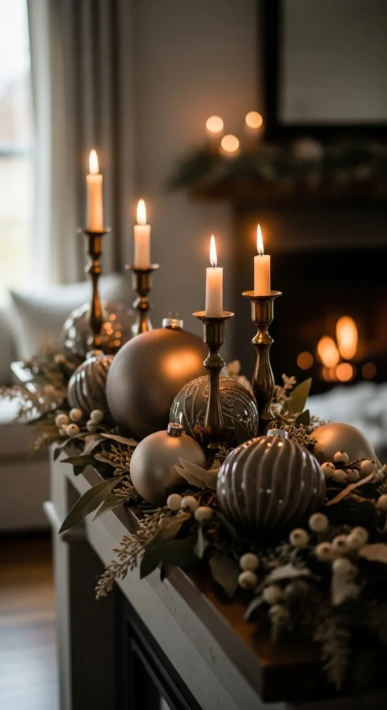
8. Soft Bronze & Cocoa Tones
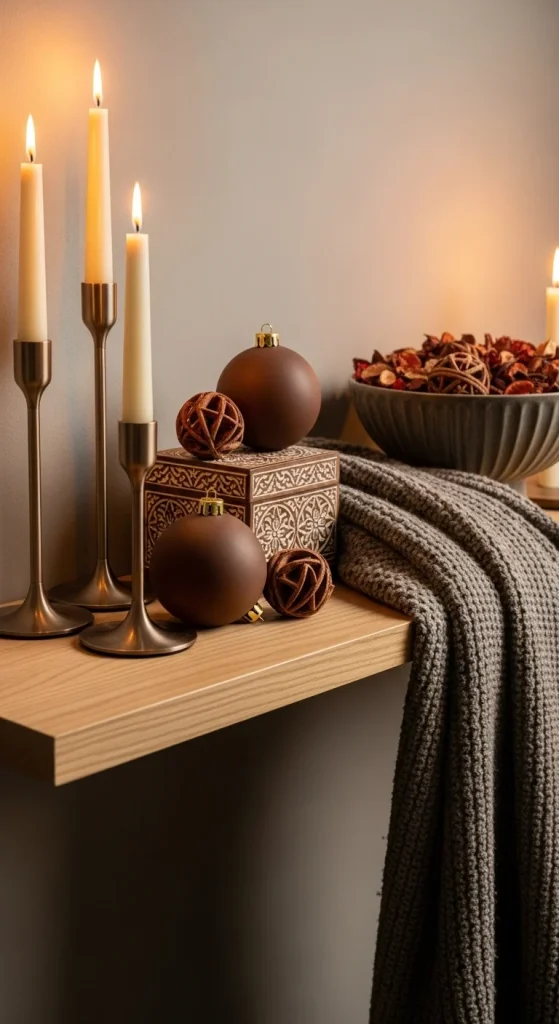
Soft bronze and cocoa tones bring warmth without overpowering the room. Start with cocoa-colored pillows, blankets, or garland ribbons. Add bronze touches through candle holders or ornament hooks. Choose matte bronze instead of shiny finishes for a softer effect. You can update old décor by spray-painting them in bronze tones. Add wood, ceramic, or woven textures to avoid making the palette too dark. Cocoa and bronze work well with cream, so mix lighter tones to balance the richness. Use layered blankets and textured pillows if you want added depth. Candlelight works beautifully with bronze décor.
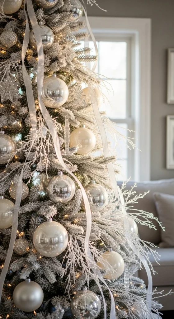
9. Frosted Neutrals With Soft Gray

Frosted neutrals are perfect for a wintery holiday look. Use soft gray as your base—gray ornaments, tapered candles, or a frosted wreath. Add frosted branches or snowy garlands for texture. Keep the palette gentle by mixing gray with cream or white. You can frost pinecones yourself by brushing them lightly with white paint. Add a textured gray blanket to warm the room. If you want contrast, add matte black in tiny amounts such as ornament hooks or candle trays. Keep everything soft to avoid a cold feel.
10. Soft Clay & Terracotta Tones
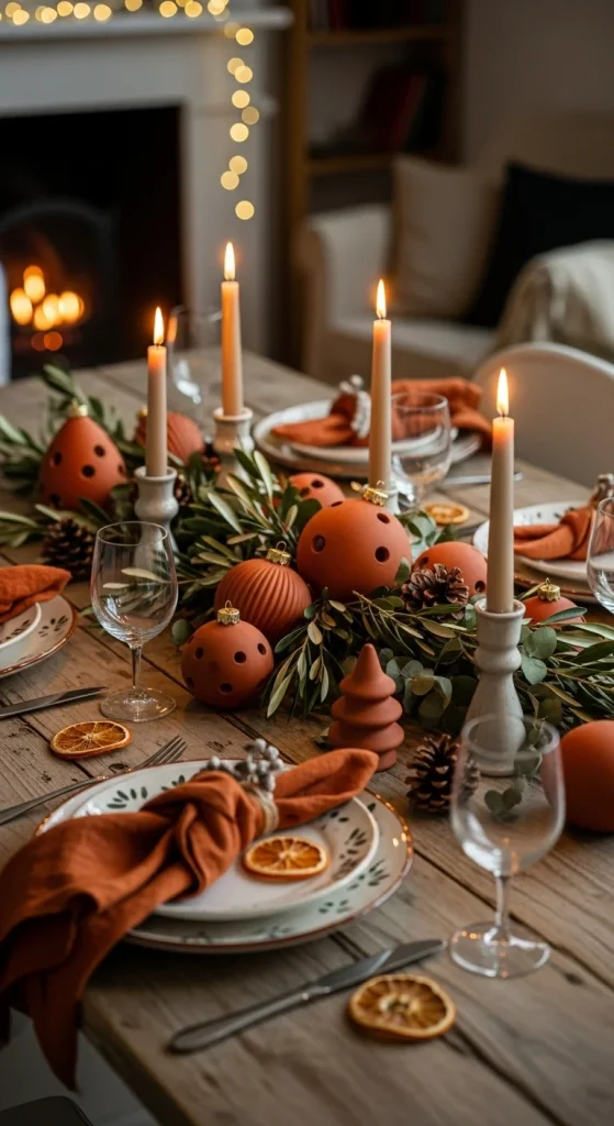
Clay and terracotta create a warm, rustic palette that feels earthy. Use clay-colored napkins, terracotta ornaments, or warm brown ribbons. Terracotta pairs beautifully with beige, cream, and wood. For DIY décor, repaint old ornaments in clay tones using chalk paint. Add woven baskets, clay vases, or wood accents to enrich the texture. Keep the palette simple so the clay tones stand out. Candlelight works well with terracotta because it brings out the warm undertones. If you want greenery, choose muted eucalyptus rather than bright pine.
11. Soft Charcoal With Warm Whites
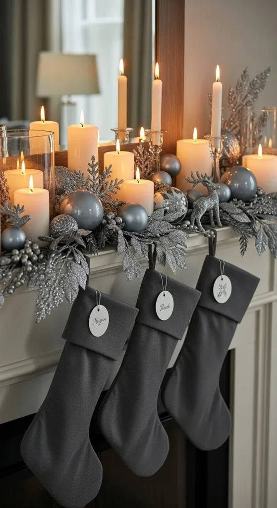
Soft charcoal gives depth without turning your décor dark. Use charcoal stockings, small bowls, or candle holders as grounding elements. Balance them with warm-white accents to keep the palette light. Warm-white ornaments, ribbons, and candles soften the contrast. You can repaint old ornaments in charcoal using chalk paint for a smooth matte finish. Add cozy items such as knit throws or boucle pillows in cream tones to keep the space inviting. Keep the charcoal accents grouped together so they feel intentional rather than scattered. Avoid using too much black, as it can make the space heavy; charcoal keeps everything subtle. Add greenery with a soft, dusty finish like eucalyptus or lamb’s ear stems. Warm lights work better than bright ones for this combination.
12. Champagne Gold & Soft White Mix

Champagne gold is calmer than yellow gold, making it perfect for neutral holiday décor. Pair champagne ornaments with soft white ribbon and warm lighting for a gentle shimmer. Choose satin or matte champagne finishes to keep the palette soft. Add white ceramic houses or frosted branches to create a wintery mood. If you want an affordable upgrade, spray-paint old ornaments using champagne-gold paint. Keep decorative items simple and minimal to avoid making the palette too shiny. Add a fluffy white tree skirt or a knitted blanket for texture. Mix a few pearl-white ornaments with champagne ones for variety. This palette works very well in living rooms with white or beige furnishings.
13. Warm Oatmeal & Cream Tones
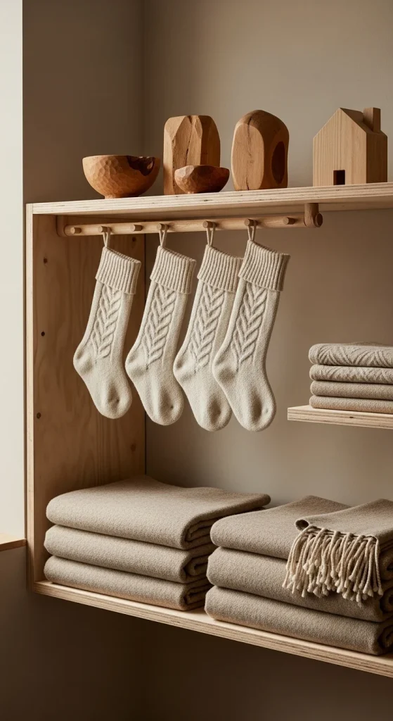
Oatmeal tones are soft, warm, and timeless. Start with oatmeal-colored throws, pillows, or stockings. Pair them with cream ornaments and light wood accents. This palette creates a cozy, understated holiday look that blends with everyday décor. Add simple touches such as kraft-paper gift wrap tied with cream ribbon. You can keep things affordable by using natural materials like twine, wood slices, and dried stems. Use warm-white lights instead of cool ones to keep the space calm. Oatmeal and cream work well together because both are soft without leaning too yellow. Include a plush rug or textured blanket to build layers. The palette looks good in bedrooms, nurseries, or small apartments where subtle décor is easier to maintain.
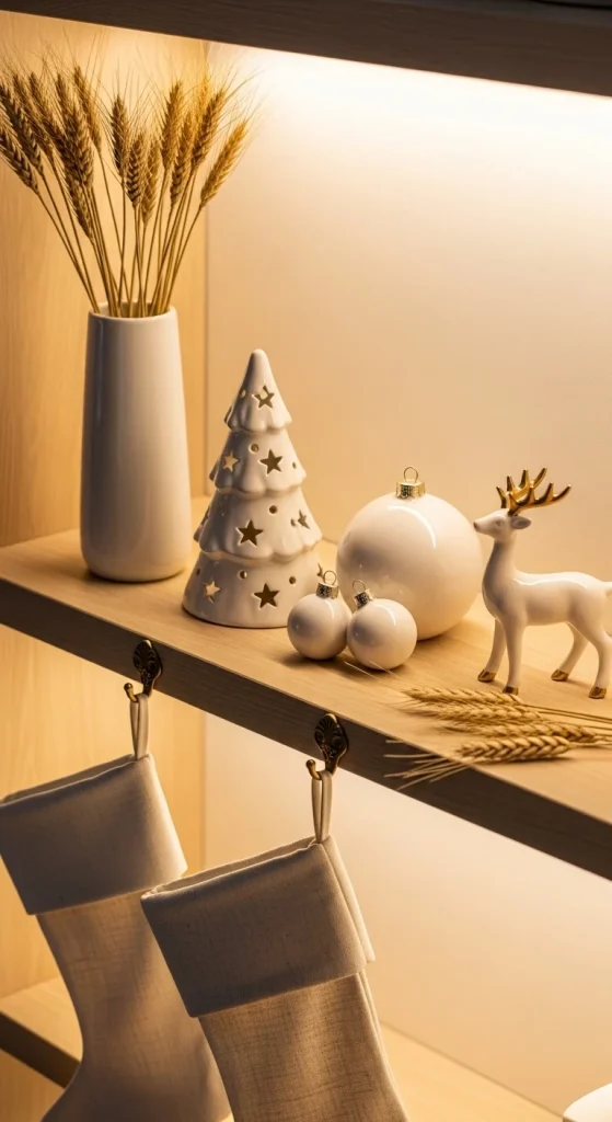
14. White Ceramic & Matte Gold Details
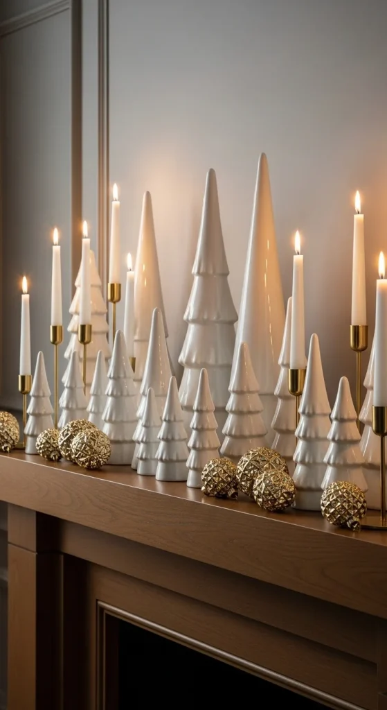
White ceramic décor creates a clean holiday look. When paired with matte-gold accents, it feels soft, warm, and modern. Use ceramic trees, vases, or village houses as your main décor. Add matte-gold candle holders or small gold ornaments for contrast. Avoid shiny gold pieces to keep the palette calm. You can paint glass vases in matte white for a simple DIY project. Add soft textures such as wool blankets or neutral pillows. Keep your display minimal so the shapes stand out. White ceramic pieces work especially well on mantels, console tables, or shelves. Add a small strand of warm lights for a gentle glow. This palette is great for those who prefer a clean and simple holiday look with a hint of warmth.
15. Soft Mushroom & Warm Linen Shades
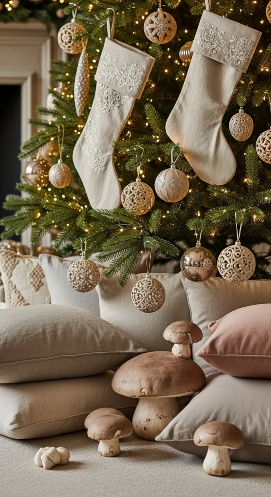
Mushroom tones sit between taupe and gray, making them ideal for neutral décor. Pair mushroom pillows or stockings with warm-linen ornaments or ribbons. This palette feels natural and calming. Add textures such as linen, cotton, or soft knits to bring depth. You can wrap gifts with linen fabric scraps for a simple DIY upgrade. To keep your décor organized, group mushroom-colored ornaments together on your tree rather than spreading one of each across branches. Add warm lights to highlight the soft tones. Mushroom pairs nicely with cream, white, and wood accents. If your home already has earthy tones, this palette will fit right in. Keep the look simple to maintain a peaceful atmosphere.
16. Dusty Rose & Cream Neutrals
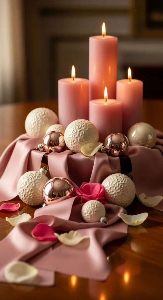
Dusty rose provides a subtle hint of color while staying within a neutral palette. Use dusty-rose ribbons on wreaths, garlands, or gifts. Pair them with cream ornaments or soft-white candles. Keep the tones muted to avoid making the palette too bold. You can make dusty-rose ornaments by mixing white and red acrylic paint until you get a soft rose shade. Add textured blankets or pillows in rose-beige tones for warmth. Use white or cream accents to balance the softness. This palette works beautifully in bedrooms or calm living rooms. Avoid bright pinks—dusty rose only works when soft and muted.
17. Soft Olive & Natural Linen Holiday Mix
Soft olive provides a quiet earthy tone that pairs well with linen and beige. Use olive stems, soft greenery, or olive-colored ribbon. Keep the greenery subtle and muted. Add linen stockings, napkins, or tree skirts to build the palette. This mix works well in rustic, boho, or Scandinavian homes. You can make your own linen ornaments by wrapping foam balls in linen fabric and tying them with twine. Pair olive tones with warm lights to avoid making the palette too cool. Add wood accents in light or medium tones. Keep the décor simple so the greenery remains soft and natural.
18. Warm Gray & Bronze Holiday Pairing
Warm gray gives a cozy touch when balanced with bronze. Start with warm-gray ornaments, blankets, or stockings. Add bronze in small pieces such as candle holders or ornament hooks. Matte bronze works better than shiny metallics for this palette. You can spray-paint old ornaments in warm-gray tones for an affordable swap. Add texture through knit blankets or ribbed pillows. Keep the palette simple so the gray doesn’t overpower the bronze. Use warm lights to keep everything soft. Warm gray pairs well with cream, beige, and wood accents.
19. White, Sand, & Driftwood Mix
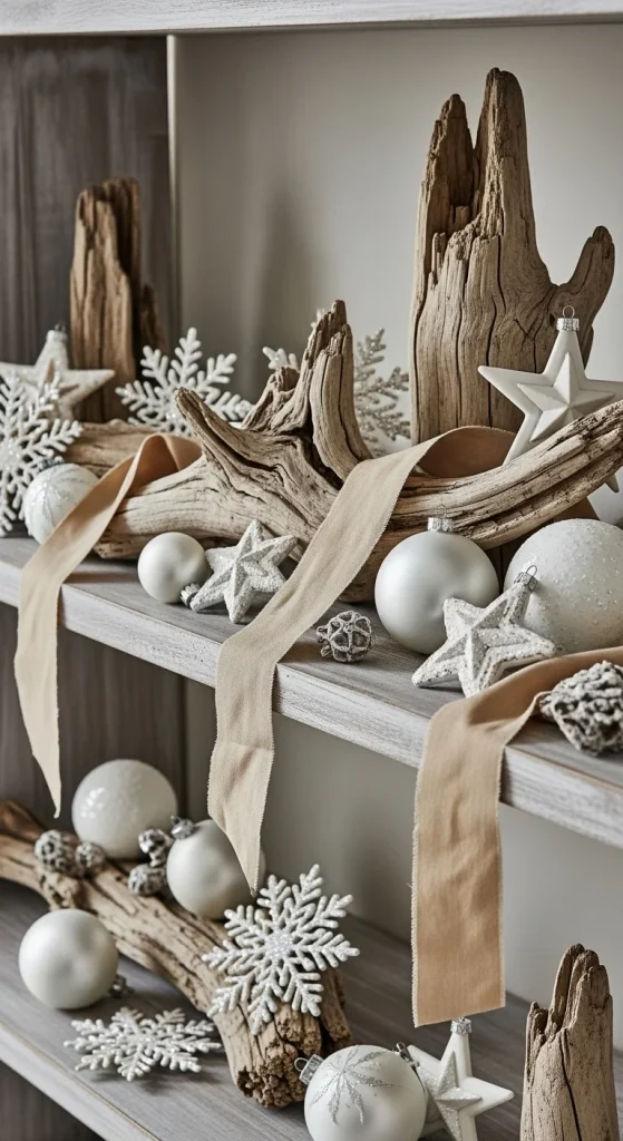
This palette brings a coastal-inspired holiday mood with a calm neutral look. Start with white ornaments or garland. Add sand-colored ribbons or napkins. Use driftwood pieces as décor—place them on shelves, in trays, or on console tables. You can find affordable driftwood-style décor at craft stores or by drying natural branches and painting them lightly with whitewash. Add soft textures such as linen or cotton blankets. Keep the palette simple to avoid clutter. Warm lights add softness and tie the colors together.
20. Cream, Wood, & Amber Glass Glow
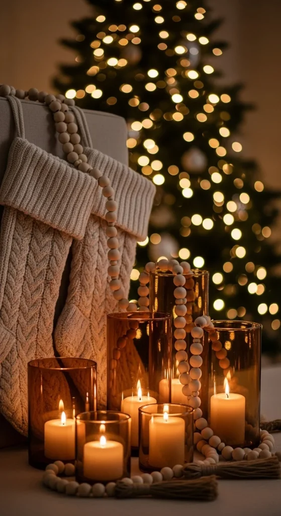
Amber glass adds warmth to any neutral holiday palette. Pair amber candle holders with cream ornaments or stockings. Add wood accents such as bead garlands or wooden bowls. Amber glass brings a gentle glow when paired with warm lights. For a simple DIY project, reuse jars by spray-painting them in amber tones. Keep the décor grouped together so the amber color doesn’t overwhelm the space. Add beige or cream blankets for extra softness. This palette works well in living rooms and dining spaces because the warm tones feel inviting.
21. Soft Linen, Wheat, & White Accents
Soft linen and wheat tones create a warm, natural palette that feels calm for the holidays. Use linen stockings, wheat-toned napkins, or fabric ribbons to set the base. Add white ceramic pieces such as village houses or simple trees to keep the look light. Wheat stems or dried florals add soft height and texture. You can tie small bundles of wheat with twine and place them on your mantel for an affordable DIY touch. Keep the palette gentle by using matte textures rather than bright finishes. If you use lights, choose warm yellow tones to match the wheat shades. Layer different linen fabrics—smooth linen, wrinkled linen, and woven linen—for depth. Add wood touches on trays or ornaments to tie the palette together. This theme works beautifully in bedrooms or cozy living rooms where softness matters.
22. Soft Khaki & Cream Holiday Style
Khaki is subtle yet warm, making it perfect for a neutral holiday palette. Pair khaki ornaments with cream blankets or pillows. Add soft greenery made of muted olive or eucalyptus stems to keep the palette grounded. Khaki ribbons on gifts look stylish while staying subtle. You can repaint old ornaments in khaki using matte craft paint mixed with a touch of beige. Add knit throws or boucle pillows in cream tones for soft texture. Keep décor minimal so the khaki tones remain calm. Warm-white lights pair best with khaki because they highlight the warm undertones. Add small wood accents for balance—wooden beads, a wood bowl, or wood-framed art. This palette works well with rustic, boho, or minimalist homes.
23. Warm Cocoa, Ivory, & Soft Gold

Cocoa adds a warm holiday feel when paired with ivory and soft gold. Use cocoa ribbons, cocoa-wrapped gifts, or cocoa-colored stockings. Pair them with ivory ornaments and soft-gold touches. Keep the gold light—thin ribbons, small bells, or candle holders. You can spray-paint old décor pieces in soft-gold tones to refresh them affordably. Add ivory blankets or textured pillows for balance. Cocoa can feel rich, so mixing it with ivory keeps the palette bright. Use warm lights for a soft glow. Add woven elements such as baskets or wooden beads if you want extra texture. This palette works especially well in living rooms and dining areas because it feels warm and welcoming without being bold.
24. Soft Sand, Pearl, & Clear Glass Holiday Look
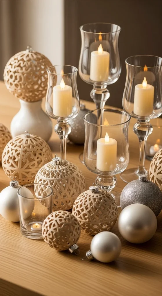
Soft sand tones paired with pearl-white accents create a calm holiday style. Add sand-colored ornaments, soft fabric ribbons, or neutral stockings. Mix in pearl baubles for gentle shine. Clear glass candle holders or vases keep the palette airy and simple. You can reuse old jars by painting the bottom half in sand tones and leaving the top clear. Add warm lights for softness—they work well with the pearl tones. Place sand and pearl ornaments together on trays or coffee tables for quiet décor moments. Add linen or cotton textures to keep the space comfortable. This palette works well with light wood furniture and neutral walls. It’s simple, soft, and perfect for calm holiday décor.
Conclusion
Neutral palettes make your holiday décor feel calm, peaceful, and stylish. With soft whites, warm taupes, muted metallics, earthy tones, and simple textures, you can create a cozy holiday atmosphere that fits every room. These palettes blend easily with your existing décor and help your home feel warm without loud colors. Pick the combinations that match your style and enjoy a calm, chic holiday season.

Emily Parker is a home décor enthusiast and design blogger who believes every space deserves a touch of warmth and personality. With a love for cozy neutrals, modern textures, and DIY styling, she shares simple, beautiful ways to make your home feel like you. When she’s not rearranging throw pillows, you’ll find her hunting vintage finds or sipping coffee while planning her next room refresh.
Leave a Reply