
Bold patterns can transform a room faster than anything else. They bring life, personality, and a touch of drama that instantly elevates your home. But using them the right way—without overwhelming your space—is where real design magic happens.
If you’ve ever wondered how designers mix patterns so effortlessly, this guide breaks it down into simple steps you can follow to create a bold, beautiful home you’ll love.
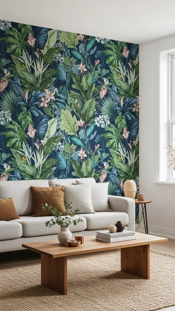
Start With One Statement Pattern
Think of your first pattern as the “lead character” of your design story. It sets the tone and guides everything else you bring into the room.
Good places to start:
- A patterned area rug
- A bold wallpaper
- Curtains with oversized prints
- A statement sofa or accent chair
Once you choose your hero pattern, everything else becomes easier. You’ll use its colours, shapes, and vibe to build the rest of your look.
Stick to a Simple Colour Palette
Bold patterns work beautifully when your colour story stays cohesive. Designers often use just 2–4 main colours when mixing prints.
A simple approach:
- Choose one main colour
- Add one or two supporting tones
- Sprinkle a neutral (white, beige, black, taupe)
This keeps your room visually balanced, even if your patterns are full of energy.
For example, if your hero pattern has navy and gold, pull those colours into your throw pillows, art, and blankets to create a connected, intentional look.
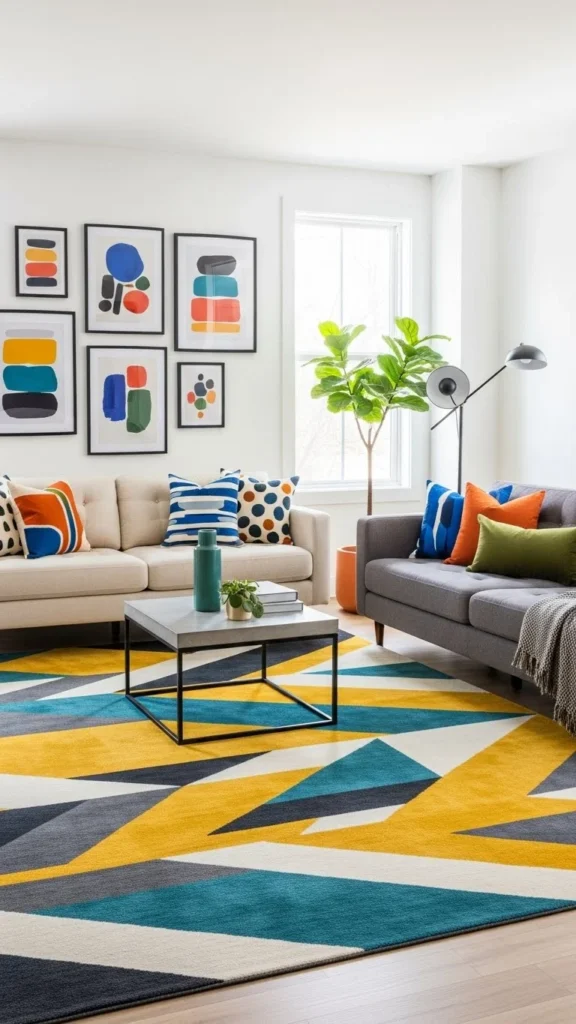
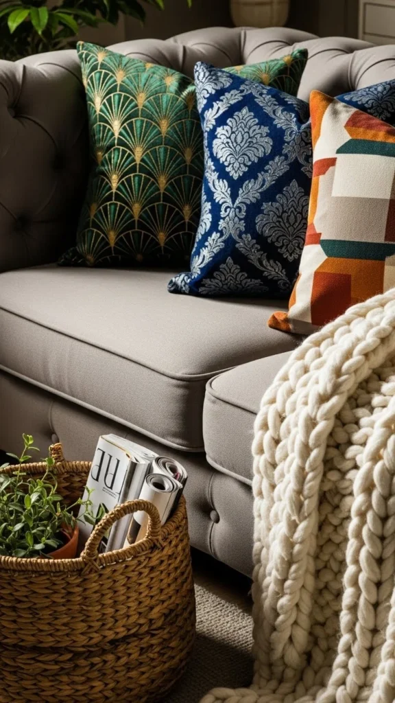
Mix Pattern Types for a Designer Look
One of the biggest secrets designers use is mixing patterns with different personalities. They avoid repeating the same pattern type and instead layer variety.
Try pairing:
- Geometric + floral
- Stripes + abstract
- Plaid + organic shapes
- Polka dots + botanical prints
This contrast keeps your room visually interesting without feeling chaotic.
Play With Scale (Small, Medium, Large)
Patterns come alive when you vary their scale. A room full of large prints can feel overwhelming, while too many tiny prints can feel busy. The trick is mixing all three.
Here’s the winning formula:
- Large-scale pattern: your main statement
- Medium-scale pattern: adds structure
- Small-scale pattern: fills in the details
For example:
- Large: big leaf wallpaper
- Medium: plaid throw blanket
- Small: thin-stripe accent pillow
This creates that perfectly curated, designer-approved look.
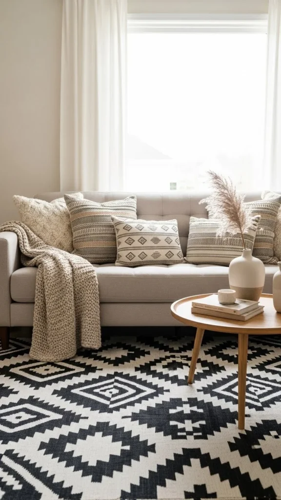
Use Neutrals as Your Safety Net
When you’re working with bold prints, neutrals act like a breath of fresh air. They give your eyes a place to rest and keep your room feeling calm.
Neutral elements you can add:
- Sofas or chairs in beige, cream, or grey
- Solid-coloured bedding
- Wooden furniture
- Woven baskets
- Neutral rugs
Neutrals help you balance intensity while still letting your patterns shine.
Add Patterns Through Small, Swappable Decor
If you’re new to bold patterns or hesitant to commit, start with things you can easily change.
Try adding:
- Throw pillows
- Blankets
- Lampshades
- Small rugs
- Art prints
- Table runners
- Patterned planters
These simple layers instantly give your home more character without requiring a major makeover.
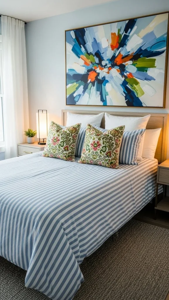
Create Contrast With Solids
When using bold patterns, solid colours help break things up. Designers use solids to highlight prints without overpowering them.
Where to use solids:
- Bedding
- Curtains
- Accent chairs
- Larger furniture pieces
- Wall paint
If your room has a lot of patterns, add a few solid-coloured accessories to balance it out.
Don’t Forget Texture—It Makes Patterns Feel Richer
Texture matters just as much as pattern. Mixing different fabric textures adds depth and softness to your design.
Texture ideas:
- Velvet pillows
- Woven throws
- Linen curtains
- Rattan chairs
- Wool rugs
When patterns and textures come together, your room feels more layered, stylish, and intentional.
Use Patterns on Unexpected Surfaces
If you want to push your creativity, patterns don’t have to stay on fabrics. Designers love using them in unexpected places.
Try adding patterns to:
- Ceiling wallpaper
- Painted floors
- Tile backsplashes
- Cabinet fronts
- Stair risers
- Closet interiors
Even the smallest patterned detail can make your home feel designer-level.
Know When to Stop (The Designer Rule!)
Even bold-pattern lovers need boundaries. A good rule is to include patterns on no more than 40–60% of what’s visible in the room.
This means:
- Use patterns generously
- But still give the eye calm spaces to land
If your room feels too busy, take away one patterned element and replace it with a solid or a neutral texture.
Final Takeaway
Bold patterns aren’t scary—they’re powerful! When you choose a hero pattern, mix scales, keep your colours cohesive, and balance with neutrals, your home will look effortlessly stylish.
Save this guide for later, and start decorating like a designer today!
Emily Parker is a home décor enthusiast and design blogger who believes every space deserves a touch of warmth and personality. With a love for cozy neutrals, modern textures, and DIY styling, she shares simple, beautiful ways to make your home feel like you. When she’s not rearranging throw pillows, you’ll find her hunting vintage finds or sipping coffee while planning her next room refresh.
Leave a Reply