
Choosing home decor colors sounds easy—until you’re staring at paint samples, cushions, rugs, and nothing feels right together. Too safe feels boring. Too bold feels risky. And suddenly, every room feels like a guessing game.
Here’s the secret designers don’t always say out loud: some color combinations just work, every single time. They’re flexible, calming, and easy to build on—no design degree required.
Let’s walk through a simple, stress-free way to choose home decor colors that always look good together.
Begin With the Mood, Not the Color Wheel
Before picking colors, decide how you want the space to feel.
Ask yourself:
- Calm or energising?
- Warm or airy?
- Cozy or minimal?
Mood matters more than trends. A relaxing bedroom needs different colours than a lively living room.
Examples:
- Calm → soft neutrals, muted greens
- Cozy → warm beige, tan, soft browns
- Fresh → whites, light greys, pale blues
Once the mood is clear, colour choices become easier.
Use the 60–30–10 Balance Rule
This rule keeps rooms from feeling chaotic.
Here’s how it works:
- 60% dominant colour (walls, large furniture)
- 30% secondary colour (sofas, rugs, curtains)
- 10% accent colour (pillows, decor, art)
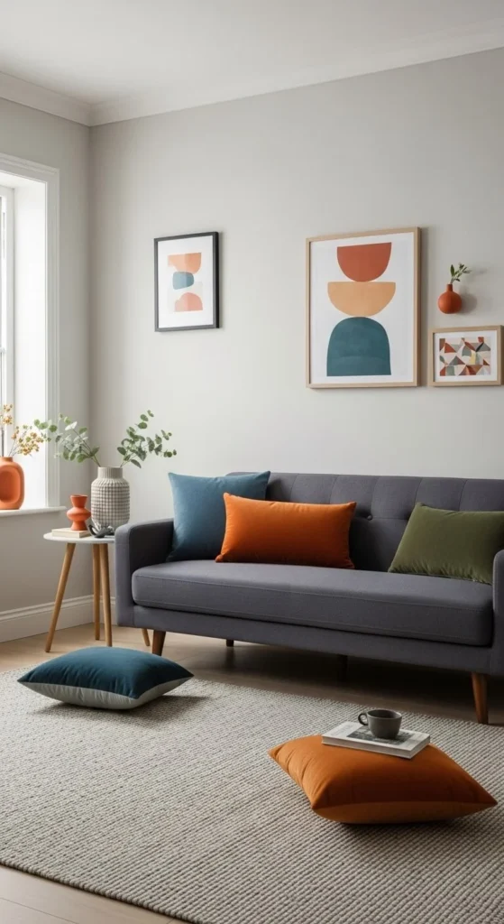
The rule creates balance without overthinking. You can bend it—but starting here prevents mistakes.
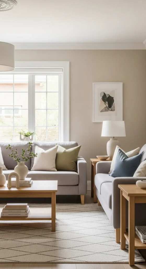
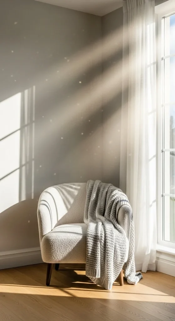
Stick to Neutrals for Your Biggest Pieces
If something is expensive or hard to replace, keep it neutral.
Best neutral bases:
- White
- Cream
- Greige
- Soft grey
- Warm beige
Use these for:
- Walls
- Sofas
- Large rugs
- Beds
Neutrals act like a blank canvas. You can change accent colors later without redoing the entire room.
Add Colour Through Easy-to-Swap Items
This is where personality comes in—without commitment.
Use colour in:
- Cushions
- Throws
- Lampshades
- Small decor
- Artwork
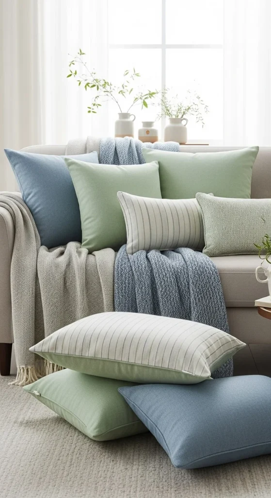
If you get tired of a colour, you can swap it out without stress. This keeps your home flexible and future-proof.
Choose Muted Shades Over Bright Ones
Bold colours aren’t bad—but they’re harder to live with.
Muted tones always feel more timeless:
- Sage instead of bright green
- Dusty blue instead of royal blue
- Terracotta instead of orange
Muted colours:
- Blend better with neutrals
- Feel calmer
- Look more expensive
If you love colour, soften it slightly. You’ll still get impact—without overwhelm.
Repeat the Same Colour in Small Ways
Rooms feel “off” when a colour appears once and disappears.
Instead, repeat it gently:
- Cushion colour echoed in a vase
- Rug tones reflected in curtains
- Decor colour matching book spines
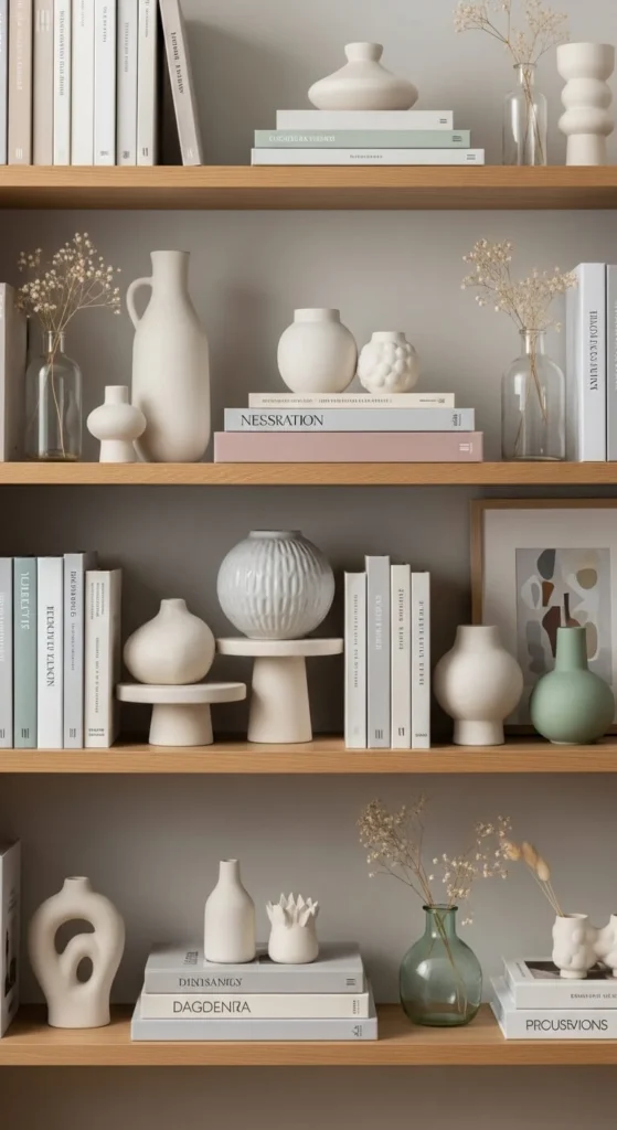
Repetition creates harmony—even when the palette is simple.
Pay Attention to Warm vs Cool Tones
Mixing warm and cool tones without intention is a common mistake.
Warm tones:
- Beige
- Cream
- Tan
- Warm wood
Cool tones:
- Grey
- Blue
- Charcoal
- Black
You can mix them—but do it on purpose.
Tip:
If your walls are warm, lean warm with furniture and fabrics. Add cool tones only as accents.
Let Natural Light Guide Your Choices
The same colour looks different in every home.
Before committing:
- Observe the room at different times of day
- Check if the light is warm or cool
- Test samples near windows and corners
Rooms with low light often need warmer tones to avoid feeling cold. Bright rooms can handle cooler shades better.
Limit Each Room to 3–4 Main Colors
More than four colours usually feels busy.
A safe structure:
- 1 main neutral
- 1 supporting neutral
- 1 soft accent
- 1 optional contrast
This keeps rooms calm and visually connected.
If you want variety, change textures—not colours.
Use Black or Dark Accents for Definition
A small amount of dark contrast grounds a space.
Try:
- Black frames
- Dark metal lamps
- Charcoal cushions
- Dark wood accents
These elements:
- Add structure
- Prevent rooms from looking flat
- Make light colours pop
Just a little goes a long way.
Trust Simplicity Over Trends
Trends change fast. Good colour choices don’t.
If a palette:
- Feels calm
- Feels balanced
- Feels easy to live with
…it’s working.
You don’t need to impress anyone. You need a home that feels good every day.
The Takeaway
Home decor colors that always work follow a few simple principles:
- Start with mood
- Use neutrals as a base
- Add muted accents
- Repeat colours gently
- Let light guide you
When in doubt, simplify.
Save this guide for later the next time colour choices start to feel overwhelming.

Emily Parker is a home décor enthusiast and design blogger who believes every space deserves a touch of warmth and personality. With a love for cozy neutrals, modern textures, and DIY styling, she shares simple, beautiful ways to make your home feel like you. When she’s not rearranging throw pillows, you’ll find her hunting vintage finds or sipping coffee while planning her next room refresh.
Leave a Reply