
Neutral homes are everywhere—and for good reason. They feel calm, timeless, and easy to live with. But there’s a fine line between soft and stylish and plain and forgettable. If your neutral space feels flat, it’s usually not the colors—it’s how they’re used.
The secret? Neutrals need depth, contrast, and intention to truly shine.
Here’s how to decorate with neutral colors so your home feels rich, warm, and anything but boring.
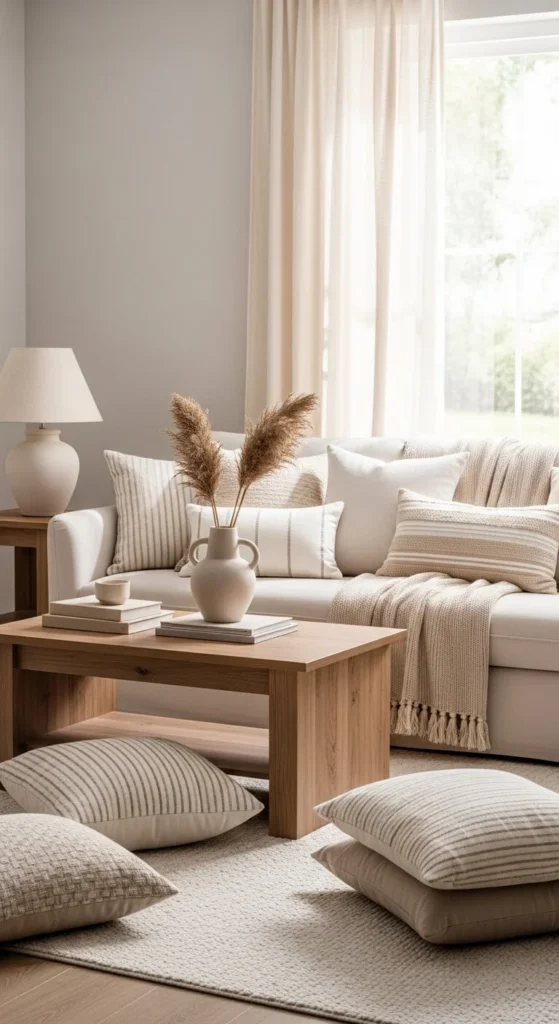
Start With More Than One Neutral Shade
One neutral alone can feel empty. Multiple neutrals working together create depth.
Instead of using just white or beige, layer:
- Warm white
- Cream
- Soft beige
- Light taupe
- Pale grey
Think of neutrals as a family, not a single color.
Tip:
If everything matches perfectly, the room will feel flat. Slight variation is what makes it interesting.
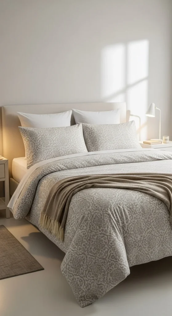
Mix Textures Before Adding Anything Else
Texture is what gives neutral rooms life.
Before thinking about decor colors, focus on how things feel:
- Linen curtains
- Wool or knit throws
- Bouclé or textured cushions
- Woven rugs
- Matte ceramics
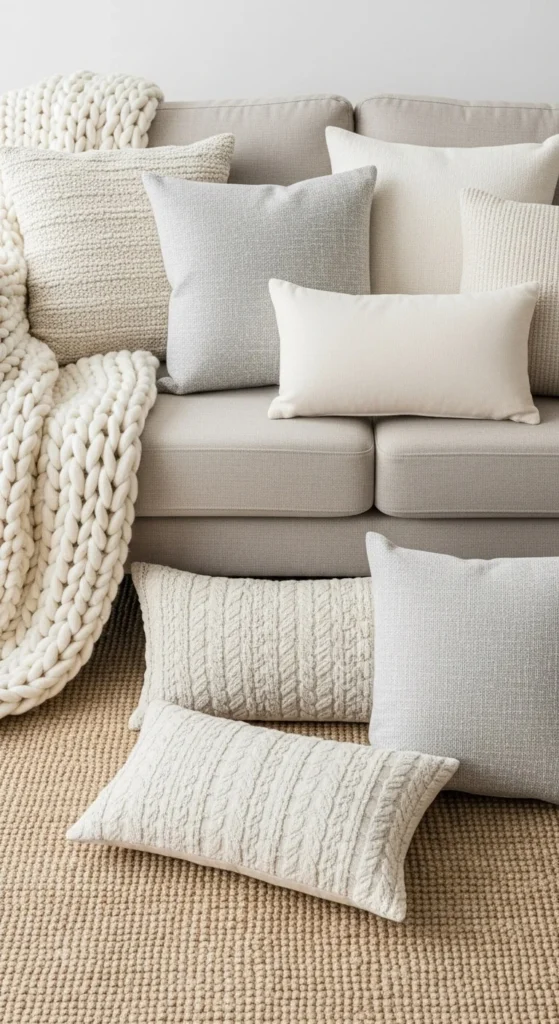
When colors are quiet, texture does the talking.
Use Contrast to Define the Space
Neutral doesn’t mean no contrast. Without contrast, rooms blur together.
Add subtle definition using:
- Black or charcoal accents
- Dark wood
- A single deep-toned object
Examples:
- Black lamp base
- Dark coffee table
- Charcoal cushion among lighter ones
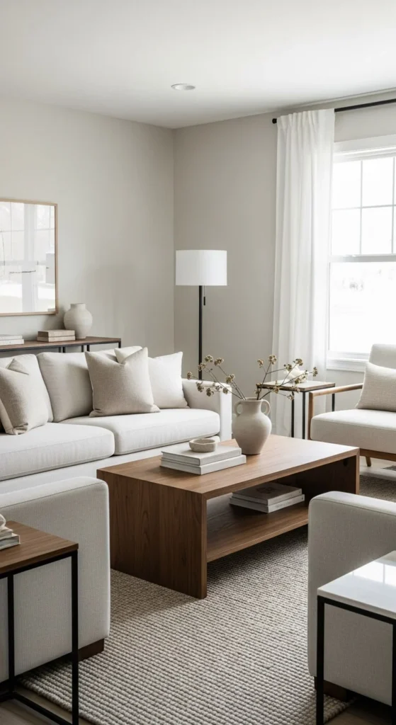
Just a little contrast makes neutrals feel intentional and grounded.
Layer Light and Shadow Intentionally
Flat lighting makes neutral rooms look lifeless.
Use lighting to create depth:
- Table lamps for warmth
- Floor lamps for height
- Soft, warm bulbs instead of cool white
Place lighting so it casts gentle shadows across walls and textures.
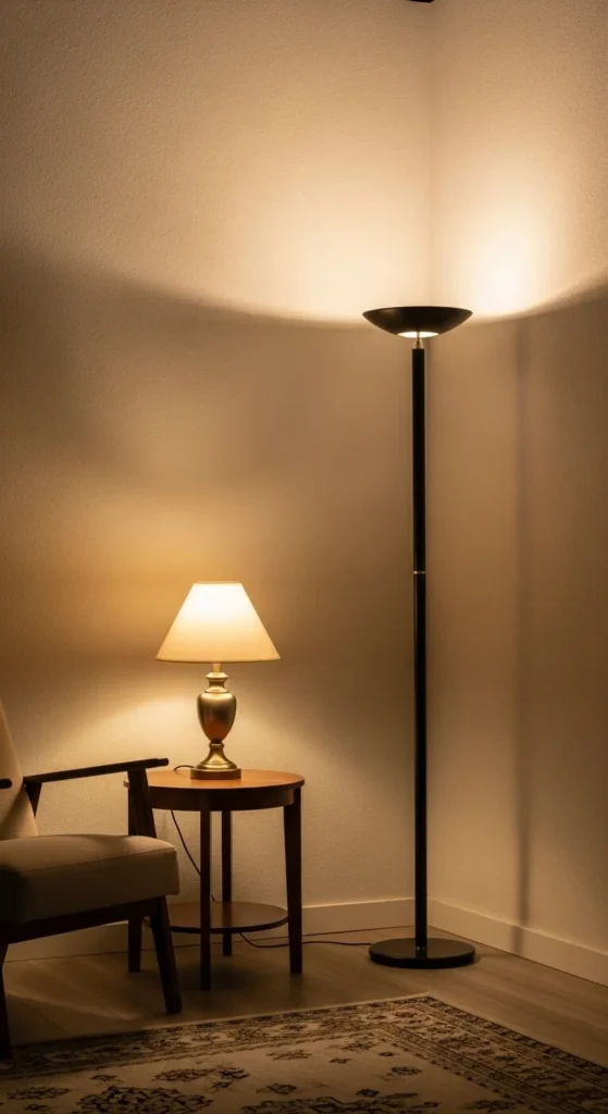
Light and shadow add dimension where color stays calm.
Introduce Natural Elements for Warmth
Nature works beautifully with neutrals.
Bring in:
- Wood (light or medium tones)
- Stone or marble
- Plants or dried branches
- Clay or ceramic decor
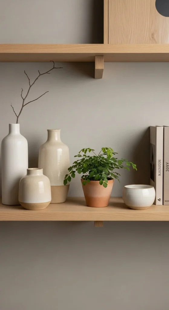
Natural materials stop neutrals from feeling cold or sterile.
Use Repetition to Create Visual Flow
Neutrals feel flat when elements appear once and disappear.
Repeat key tones and materials:
- The same wood finish in two places
- A cushion color echoed in decor
- A ceramic texture repeated on shelves
Repetition creates rhythm. Rhythm creates interest.
Add Soft Pattern—Not Bold Prints
Neutrals don’t need loud patterns to stand out.
Look for:
- Subtle stripes
- Gentle checks
- Organic patterns
- Tonal prints
Keep patterns:
- Low contrast
- In similar color families
Patterns should whisper, not shout.
Style in Layers, Not Single Pieces
Single neutral items can disappear visually.
Instead of one cushion, use three.
Instead of one decor piece, use a small group.
Layer:
- Different shapes
- Slightly different tones
- Varying heights
This makes the space feel curated instead of sparse.
Anchor the Room With One Grounding Element
Every neutral room needs something that holds it together.
This could be:
- A textured rug
- A statement sofa fabric
- A large piece of furniture in a deeper neutral
This anchor prevents the room from feeling like it’s floating.
Use Empty Space as a Design Tool
Neutral spaces need breathing room.
Don’t fill every surface. Let some areas stay intentionally empty.
Empty space:
- Highlights texture
- Makes decor feel more expensive
- Keeps the room calm
Flat rooms often come from trying to “fix” neutrals by adding too much.
Add One Unexpected Detail
This is what makes a neutral space memorable.
Try:
- An unusual lamp shape
- A sculptural vase
- A curved mirror
- A unique chair texture
One unexpected detail adds personality without breaking the calm.
Final Check: Does It Feel Warm?
Neutral rooms shouldn’t feel cold.
Ask yourself:
- Does the room feel inviting?
- Would I want to sit here for an hour?
- Does it feel layered, not empty?
If the answer is yes, you’ve done it right.
The Takeaway
Decorating with neutral colors doesn’t mean playing it safe. It means building depth with texture, contrast, light, and repetition.
Remember:
- Use multiple neutral shades
- Layer textures generously
- Add subtle contrast
- Let light and materials do the work
Neutrals aren’t boring. Flat styling is.
Save this guide for later the next time your neutral space feels like it’s missing something.

Emily Parker is a home décor enthusiast and design blogger who believes every space deserves a touch of warmth and personality. With a love for cozy neutrals, modern textures, and DIY styling, she shares simple, beautiful ways to make your home feel like you. When she’s not rearranging throw pillows, you’ll find her hunting vintage finds or sipping coffee while planning her next room refresh.
Leave a Reply