
A curated gallery wall can completely change the feel of a room. It adds personality. It tells a story. And it makes even a simple space look thoughtfully styled.
The good news? You don’t need a big budget or an interior designer. With the right layout, frame choices, and a bit of planning, you can create a gallery wall that looks polished and intentional. Below are 23 creative ideas to help you design one that fits your style and your space.
1. Symmetrical Grid Layout for a Clean Look
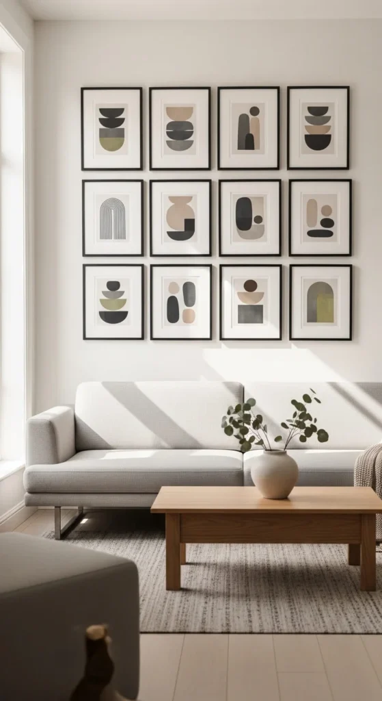
A symmetrical grid layout is perfect if you love order and clean lines.
Choose frames that are the same size and color. Black, white, or natural wood work well. Keep the spacing equal between each frame. Use a level and painter’s tape before you hang anything.
This style works beautifully with family photos or black-and-white prints. It feels calm and balanced. Nothing looks random.
If you’re on a budget, print your photos in standard sizes like 8×10. Buy affordable frames in bulk. You can even spray paint mismatched thrifted frames to make them look uniform.
Measure twice before hammering nails. Start from the center and work outward. That helps keep everything aligned.
This layout works well in living rooms, hallways, and above a sofa. It gives a polished look without feeling busy. Simple. Clean. Easy to maintain.
2. Floor-to-Ceiling Drama
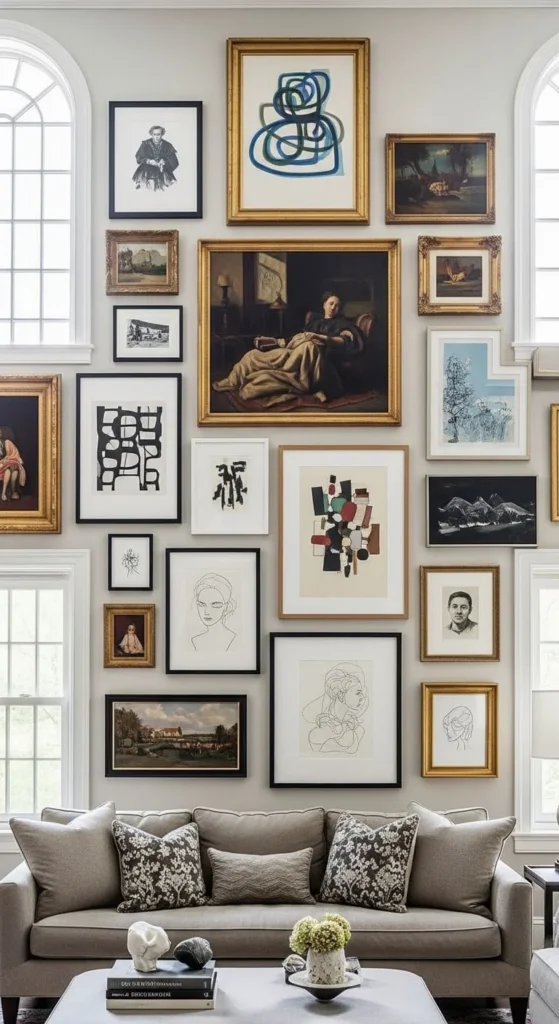
If you want impact, go tall.
A floor-to-ceiling gallery wall makes the room feel bigger. It draws the eye upward and fills empty vertical space.
Mix frame sizes. Combine large statement pieces with smaller prints. Start from the center and build outward. Keep the spacing fairly consistent so it still feels intentional.
You don’t need expensive art. Print digital downloads. Frame fabric swatches. Use your own photography. Even children’s artwork can look polished in simple frames.
Lay everything on the floor first. Rearrange until it feels right. Take a photo so you remember the layout.
This idea works especially well in rooms with high ceilings. It adds warmth to blank walls and makes the space feel layered without adding clutter to the floor.
3. All-Black Frame Gallery Wall
Using all black frames creates instant cohesion.
Even if the artwork varies, the consistent frame color ties it together. It looks intentional and polished.
Mix different art styles. Photography. Abstract prints. Line drawings. Keep the frames black and the mats white for contrast.
Budget tip: Buy basic black frames from discount stores. Replace the backing if needed, but keep the frame.
This look works well in modern, minimalist, and even farmhouse spaces. It gives structure without feeling heavy.
Spacing should be even. Around two inches between frames usually works well.
The result feels curated but not chaotic. Clean edges. Clear boundaries. Easy to update later by swapping out the art inside.
4. Warm Wood Frames for a Cozy Feel
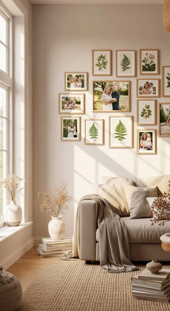
If your home leans warm and inviting, wood frames are a great choice.
Use light oak, walnut, or mixed natural finishes. The warmth of wood softens the wall and adds texture.
Pair wood frames with nature prints, family photos, or soft abstract art. It works beautifully in boho, rustic, or Scandinavian-style homes.
Thrift stores are perfect for this. Look for real wood frames. Lightly sand and stain them to match if needed.
Keep the layout slightly structured. Not too rigid. Not too scattered. Aim for balance.
This style feels welcoming. It doesn’t try too hard. It looks like it grew over time.
5. Centered Above the Sofa
A gallery wall above the sofa should feel balanced.
Keep the width about two-thirds the length of the sofa. That keeps it proportional.
Start by hanging the center piece at eye level. Then build around it. Keep the entire arrangement about 6 to 8 inches above the sofa.
Mix frame sizes but keep the spacing consistent.
If you’re renting, use removable hooks or picture hanging strips. They can hold lightweight frames and prevent wall damage.
This layout anchors the seating area. It fills the blank space without overpowering it.
It looks polished when it feels connected to the furniture below.
6. Black and White Photography Theme
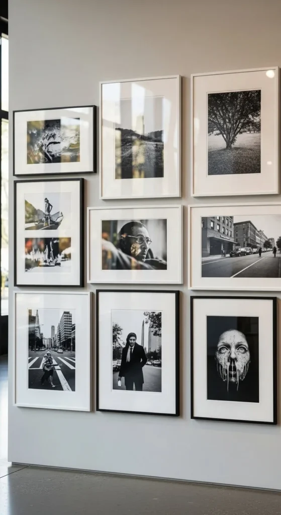
Using only black and white photography keeps things simple.
It removes color chaos. It makes everything feel cohesive.
You can mix candid family shots with landscape photography. Even old printed photos can work.
Print them in the same size for a clean grid. Or mix sizes for more movement.
Online printing services often have discounts. Watch for sales and print multiple images at once.
Black and white images feel timeless. They work in almost any room. They don’t clash with changing decor.
This is one of the easiest ways to create a polished gallery wall without overthinking color coordination.
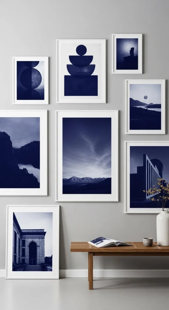
7. One Color Story
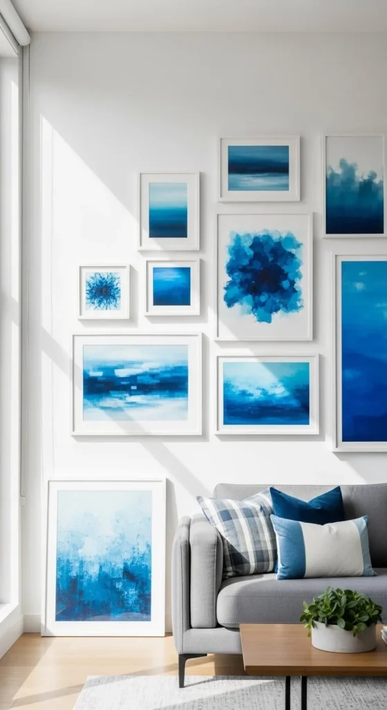
Choose one color and stick with it.
Blue. Green. Beige. Soft pink. Pick what works with your room.
The artwork can vary in style. Abstract. Photography. Typography. But keep the color palette tight.
This creates harmony. It looks curated rather than random.
DIY tip: Edit your photos with the same color filter before printing. That keeps everything aligned.
White frames help the artwork stand out without adding visual clutter.
A single color story makes the wall feel intentional. It’s simple to execute. And it’s easy to update later.
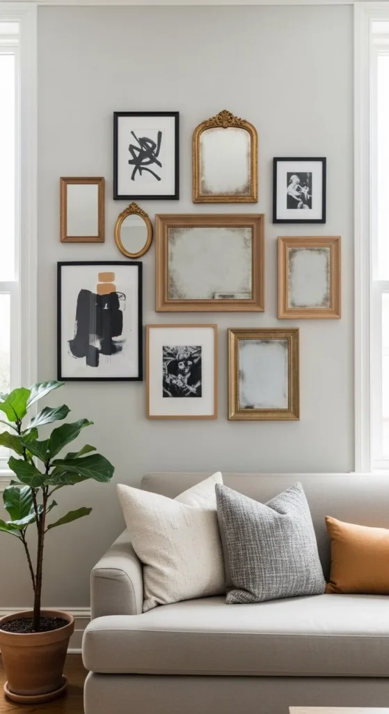
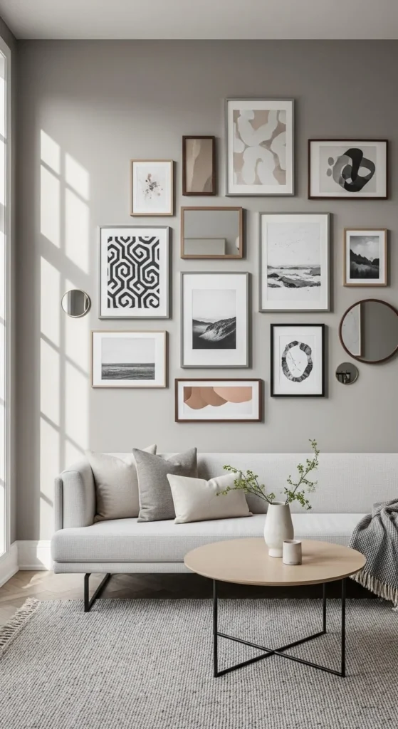
8. Mix in Mirrors
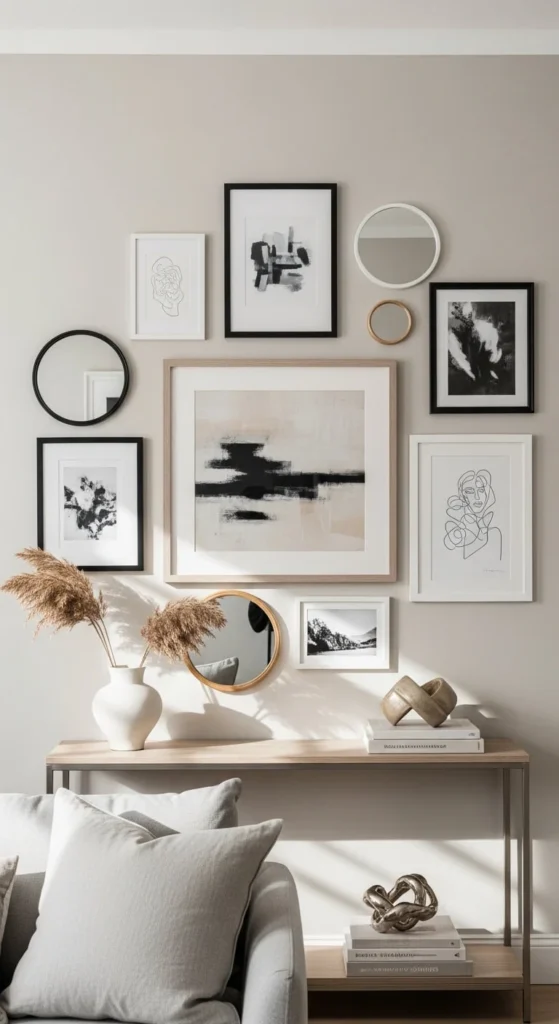
Adding mirrors breaks up flat artwork.
They reflect light. They make small rooms feel bigger.
Use small round mirrors between frames. Keep the spacing consistent so it still feels organized.
Thrift stores often carry affordable mirrors. Spray paint the frames to match your gallery wall.
Place mirrors where they catch natural light. That brightens the whole wall.
Mixing art and mirrors adds depth. It feels layered but not cluttered.
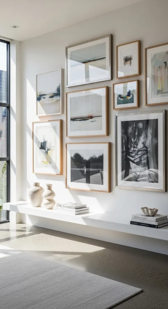
9. Ledge-Style Gallery Wall
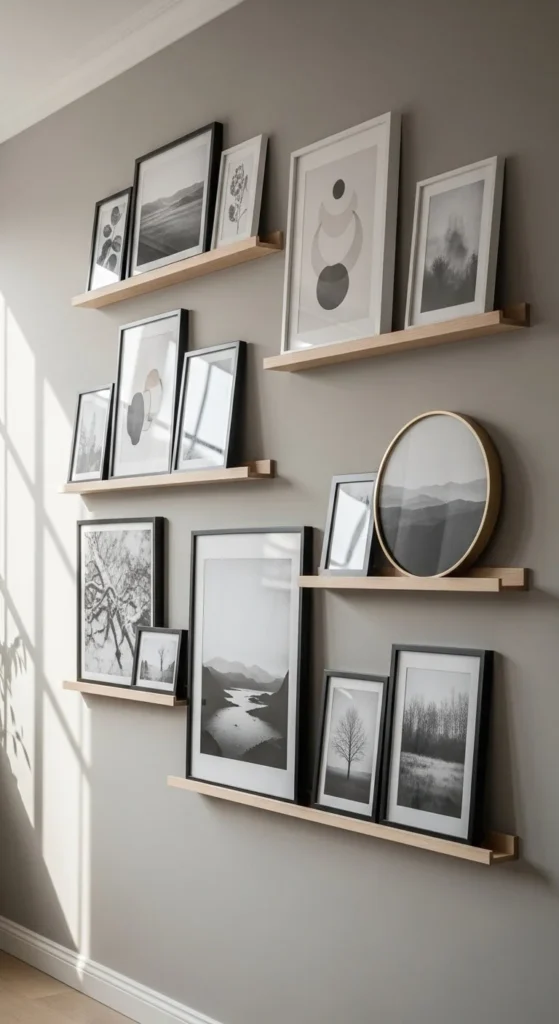
Install picture ledges instead of hanging frames directly.
You can lean frames against the wall. Overlap slightly for depth.
This setup makes swapping art easy. No new holes in the wall.
IKEA-style floating shelves are affordable. Install them securely into studs.
Layer larger frames in the back. Smaller ones in front.
This style feels relaxed but still curated. It’s perfect if you like changing your decor often.
10. Gallery Wall Around a TV
A TV doesn’t have to sit alone on a blank wall.
Frame it with artwork around the edges. Keep the frames evenly spaced.
Choose art that complements the TV’s black frame. Black or dark wood frames work well.
Start with the TV as the center point. Build outward.
This helps the TV blend in rather than stand out.
It makes the entire wall feel styled instead of dominated by electronics.
11. Minimalist Two-Row Layout
If you prefer simplicity, try two clean rows.
Use frames of equal size. Align the tops and bottoms carefully.
Keep spacing consistent. Measure before hanging.
This layout works well in dining rooms or hallways.
It feels structured. Calm. Easy to replicate.
You don’t need many pieces. Six to eight frames can be enough.
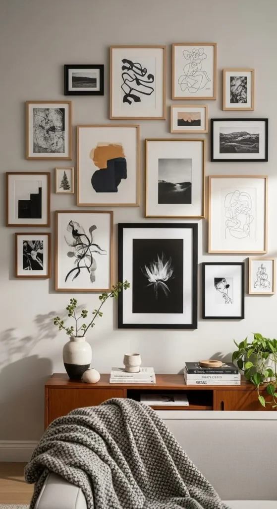
12. Mix Frame Shapes
Add interest by mixing shapes.
Combine square, rectangular, and round frames.
Keep one element consistent. Maybe the frame color or the artwork style.
This keeps the mix from looking messy.
Lay everything out on the floor first. Adjust until it feels balanced.
The different shapes create movement. It feels playful but still organized.
13. Oversized Statement Anchor
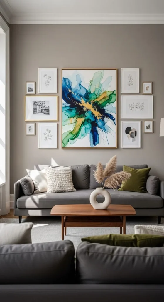
Start with one large piece in the center.
Then surround it with smaller frames.
The large artwork anchors the wall. The smaller ones add detail.
You don’t need expensive art. Print a large-scale photo at a copy shop.
Keep spacing even around the center piece.
This layout feels grounded and polished.
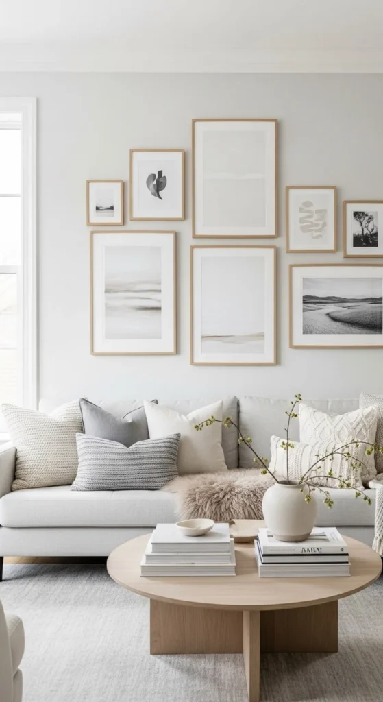
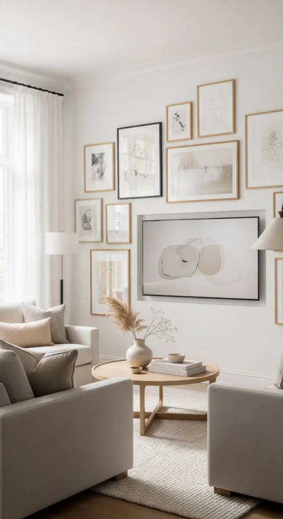
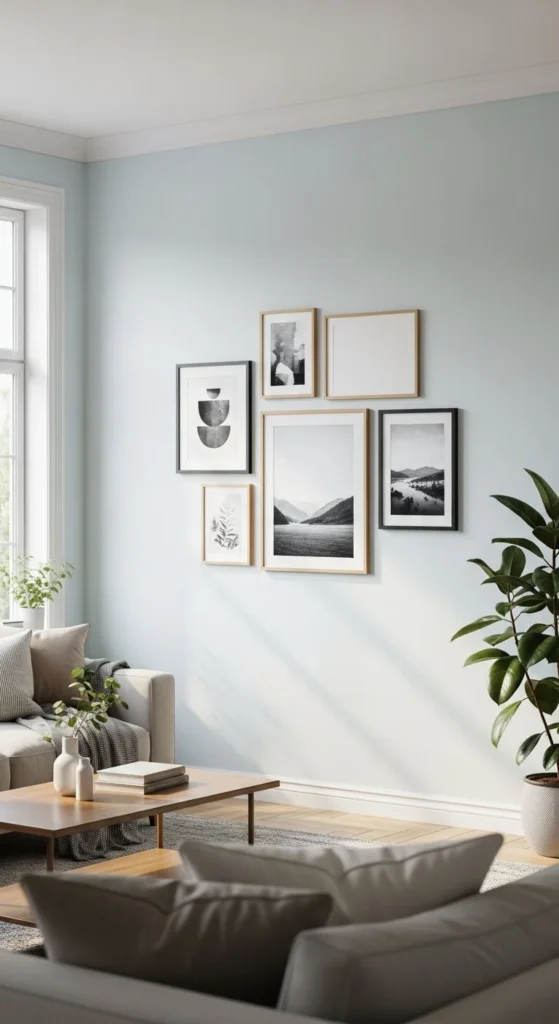
14. Neutral-Toned Artwork Only
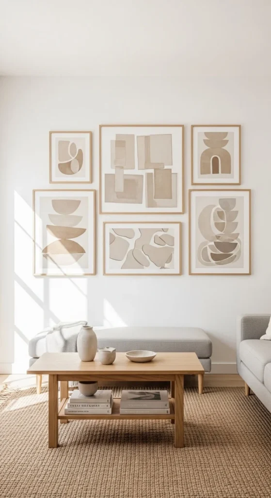
Stick to beige, cream, gray, and soft brown.
Neutral artwork keeps the room feeling calm.
It works well if your furniture already has strong colors.
DIY tip: Print black and white images and use slightly off-white paper.
Neutral gallery walls feel cohesive and easy on the eyes.
15. Staircase Gallery Wall
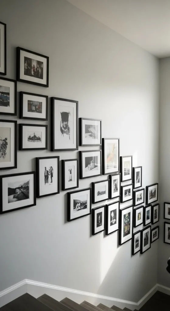
Follow the angle of your staircase.
Keep the frames aligned along the slope.
Use similar frame sizes for a clean look.
Start at the bottom and work upward.
Measure carefully so spacing stays consistent.
This turns an empty stair wall into a focal point.
16. Family Timeline Wall
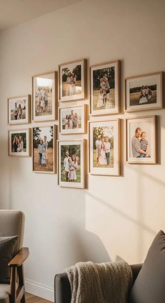
Arrange family photos in chronological order.
Baby photos on one side. Recent photos on the other.
Use matching frames for consistency.
This tells a visual story.
Print during sales to keep costs low.
It feels personal and meaningful.
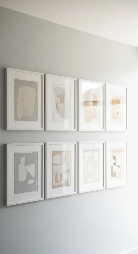
17. Monochrome Art Prints
Choose one bold color like deep green or navy.
Print artwork in varying shades of that color.
White frames keep it clean.
This makes a statement without clashing.
It’s simple but striking.
18. Small Space Cluster
If you have a small wall, create a tight cluster.
Keep frames close together.
Use smaller sizes like 5×7 or 8×10.
This makes the space feel intentional rather than sparse.
It works well in apartments or entryways.
19. Mix Art and Personal Objects
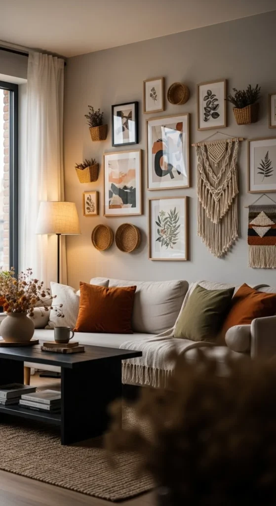
Add texture with small wall objects.
Think woven baskets or small wall hangings.
Mix them between framed art.
Keep colors cohesive.
This adds dimension and warmth.
20. Gallery Wall in the Dining Room
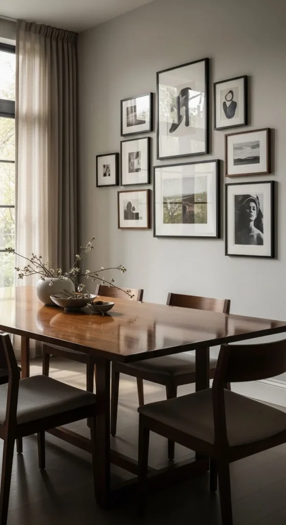
Dining rooms often have empty walls.
A gallery wall adds character.
Keep it centered above the table.
Choose artwork that feels warm and welcoming.
It makes everyday meals feel more special.
21. Hallway Story Wall
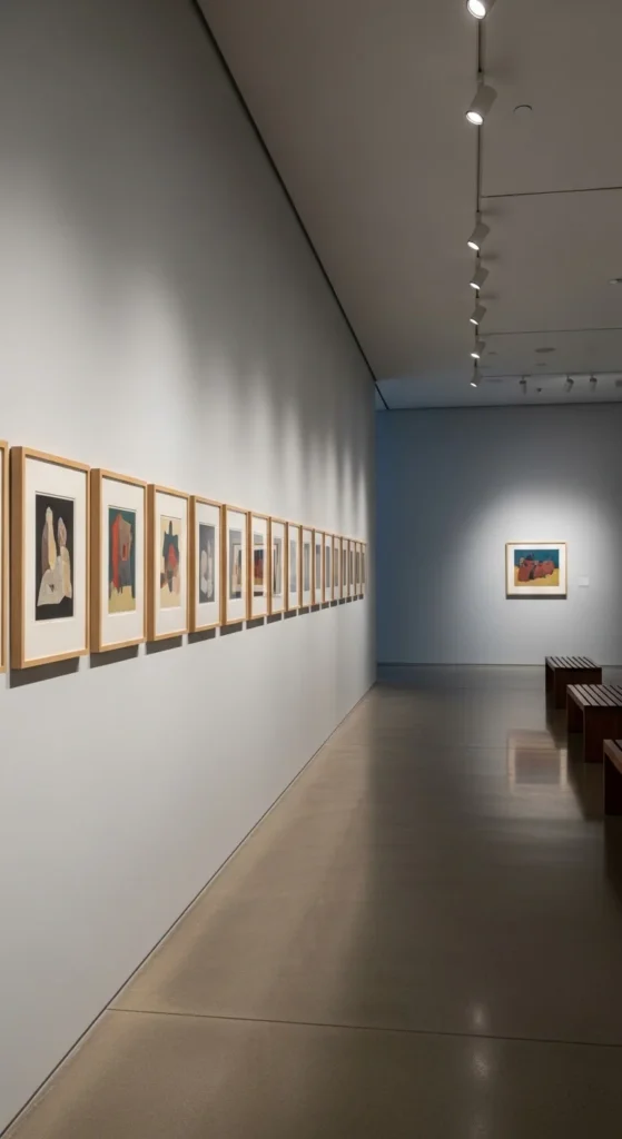
Line frames evenly down a hallway.
Keep them at eye level.
Use matching frames for a polished look.
Hallways are perfect for photo collections.
It turns a pass-through space into something personal.
22. Mix Matte and Glossy Finishes
Combine matte art prints with glossy photos.
The contrast adds subtle interest.
Keep frame colors consistent.
This adds depth without visual clutter.
It’s an easy way to make your gallery wall feel layered.
23. Start Small and Grow Over Time
You don’t need to fill the wall all at once.
Start with three to five frames.
Add more as you find pieces you love.
Keep spacing consistent as you expand.
This keeps the wall feeling curated instead of rushed.
Building slowly often looks more natural.
Conclusion
A polished gallery wall doesn’t require a huge budget or professional help. It just takes planning, consistent spacing, and a clear idea of what you like. Whether you prefer clean grids, cozy wood frames, or bold monochrome prints, there’s a layout that fits your home. Start small. Measure carefully. Use affordable frames. With a little effort, your blank wall can become one of your favorite features in the room.
Emily Parker is a home décor enthusiast and design blogger who believes every space deserves a touch of warmth and personality. With a love for cozy neutrals, modern textures, and DIY styling, she shares simple, beautiful ways to make your home feel like you. When she’s not rearranging throw pillows, you’ll find her hunting vintage finds or sipping coffee while planning her next room refresh.
Leave a Reply